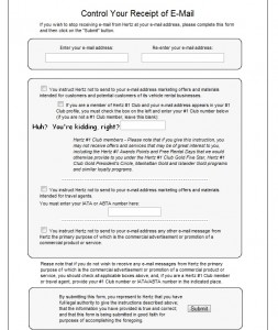
I absolutely understand companies that communicate via email sometimes ask for feedback when they receive an unsubscribe request. The most common use I’ve seen of this practice is when a link is offered in the email. A person choosing to unsubscribe clicks that link and is sent to a web page where they often receive a message acknowledging that they are no longer subscribed. There may be a little text box below that asks for some input, but in theory perhaps we can all agree that the biggest roadblock to a unsubscribe should be a click or a reply email with the word “unsubscribe”.
Sometimes a company asks me to key an email address if I have multiple emails forwarding to one email address. I don’t remember which email the company uses, and now I actually have to think about how to tell a company to leave me alone. That’s most frustrating because coding an unsubscribe link with the address is so easy for the email sender. But that’s a minor inconvenience. Sure, it shows a lack of respect for my time, but I’ll recover.
Then this weekend I found the absolute worst unsubscribe process I’ve ever seen. I’m not even thinking about companies that send unwanted email and won’t unsubscribe. This is worse. This unsubscribe from Hertz reproduced below seems as if someone let the lawyers run wild in marketing with the result that only those with serious time on their hands will complete the process.
I had all the fancy Hertz Gold and #1 President Club hoo-hah stuff at one point when I traveled every week, but I don’t travel every week any more so I decided to kill the emails. This is a company that generates $7 to $8 billion each year in revenue. They have more than 20,000 employees. Surely someone has suggested in some program somewhere that the email unsubscribe process is horrible. I do not exaggerate when I say that Hertz’ email unsubscribe is the worst I’ve ever seen in more than 20 years of online commerce. Don’t take my word for it. Once you click a link in an email, you get the form below. Leave a comment and share whether you think this is appropriate. Or is there really a worse one out there that I’ve missed?

Father Loppes
Maybe you should try posting an image that people can actually read….
George Bounacos
It was a page of 8 point type. I used an Internet convention of clicking the graphic to examine detail. Maybe you noticed it in the caption.
Alexander Zagoumenov
I think Dell has the worst unsubscribe process of all. I’ve been trying to unsubscribe forever but end up leaving as I don’t have time to complete the entire form. Too much to read. So I just end up deleting these messages.
George Bounacos
Hey, Alexander, thanks for posting. If you’re using Gmail or a similar program for email, try marking the messages as spam. If nothing else, you’ll train your email client to send them to your spam filter. Unsubscribe forms make me a little crazy. I don’t mind a message that says “You’re unsubscribed. You would really help us learn how to serve everyone better by answering these 3 questions. People tell us it takes less than 2 minutes.”
That is at least respectful of customers.